ErbisOne is created to process an infinite amount of data from every possible data source into reliable information about the energy consumption. In the ErbisOne portal you can access a complete set of reports by default through which your organization can gain insight in the energy consumption and the possible savings. In this second blog from the series ‘Featured!’ you will learn more about the power of reports in ErbisOne.
From data to relevant information
The data in your buildings contain valuable information, especially when the data is imported structurally, like data from your data company, (smart) energy meters, dataloggers, BMS and sustainable energy production. When this data is combined with other types of data like opening hours, outside temperatures and building size, relevant and interesting insights are unveiled. In the ErbisOne basic monitoring you have access to a number of automatically generated consumption reports, dependable on the energy flows in your building.
The consumption report
When a consumption report is opened, ErbisOne at first shows a graph of the consumption per energy flow, for example gas or electricity, over a certain period. The period which is shown and the interval can easily be adjusted. To make additional analysis of your consumption, you can add optional data to the graph, like (outside) temperature, degree days and/or the consumption of last year. Additionally you can easily add filters, like the opening hours and the high/low tariffs. These automatically generated consumption reports are available as standard for all ErbisOne users.
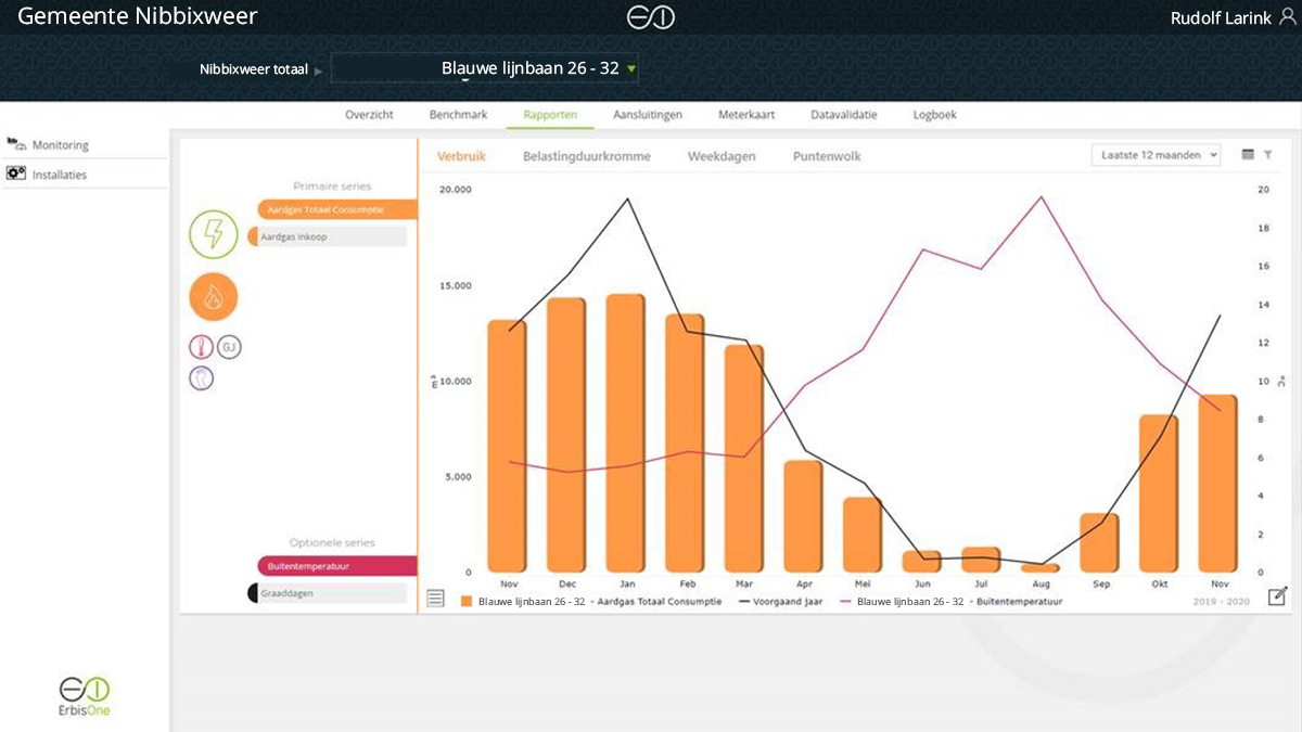
An example of a consumption report
ErbisOne energy monitoring, save energy with the help of smart reports
Which makes working with ErbisOne attractive, is the large computing power and the speed of the system. The imported data is directly translated into relevant reports that unveil the possibilities for savings. ErbisOne users have access to a number of really useful reports, like the weekday profile, the load duration curve and the point cloud graph.
The weekday profile
In ErbisOne the energy consumption of your buildings can be compared to the hours of the day in multiple ways. This way you can make a report of the right moments when your consumption has taken place. An example of this is the weekday profile. This report shows in one overview what the consumption is per hour of every day of the week. With this you can easily recognize the user profile of your building, for gas as well as electricity. With the weekday profile you prevent a too high consumption outside of the opening hours, a too early starting up of the climate installations and a too high basic load. All tree are mistakes which are made often and are caused by wrong settings of installations; an important cause of a lot of energy- and cost waste in Dutch buildings.
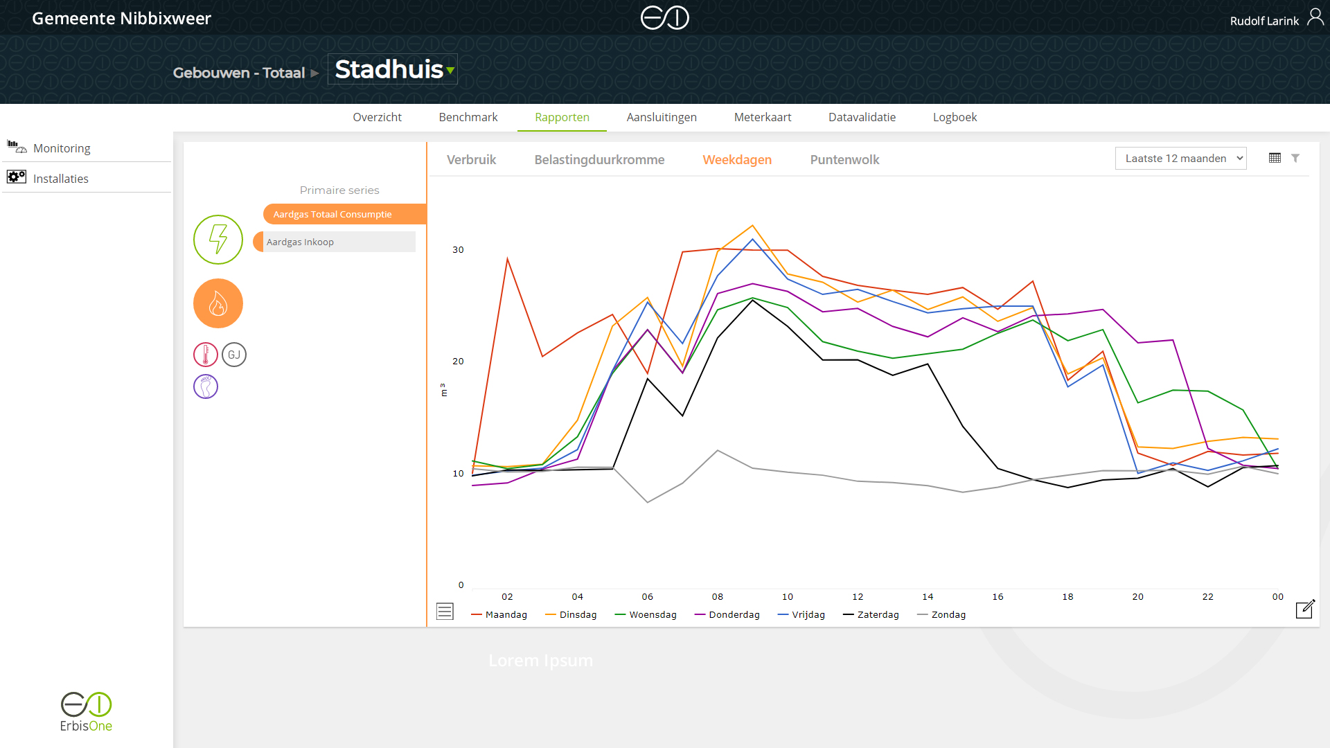
On this image you can see an example of a weekday profile of a city hall. In this profile a high consumption way outside the opening hours and in the weekend can be seen. The installation is not set the right way to the opening hours of the building.
ErbisOne energiemonitoring energie besparen met hulp van slimme rapportages
The load duration curve
Another report form in ErbisOne is the load duration curve. In this report you can compare your electricity consumption to the number of hours in a year. In a load duration curve you have a direct insight in the height of your basic load and your maximum power. On this basis you can take measures to lower the base load or your contracted maximum power use. If the opening hours of your building are also known in ErbisOne, these can also be used in the load duration curve and it then becomes clear what your consumption is within and outside of the opening hours. This way you can see directly whether your organization uses too much energy outside of the opening hours.
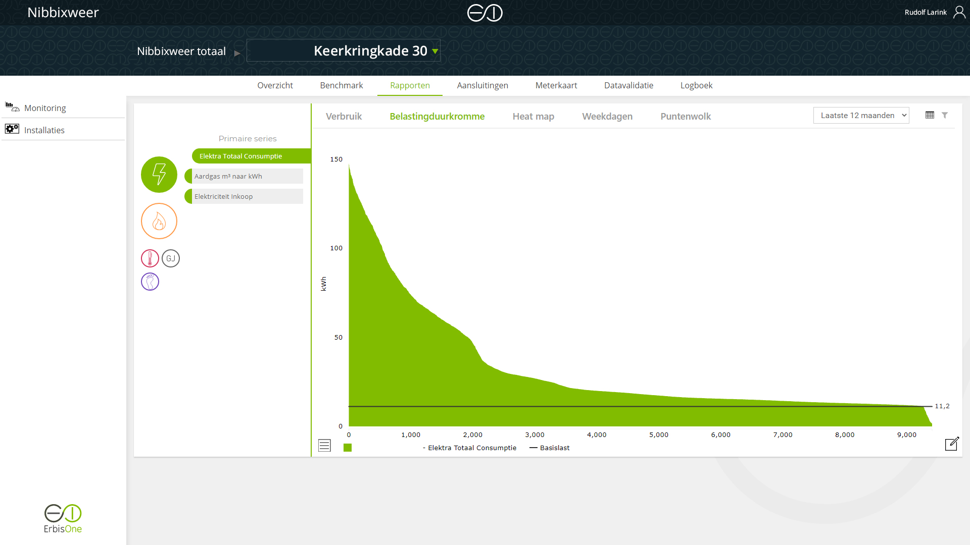
EAn example of a load duration curve as it is supposed to look, with a normal base load and a consumption conform the opening hours.
ErbisOne energiemonitoring energie besparen met hulp van slimme rapportages
The scatterplot
NBesides comparing the energy consumption against time, also the relation between the consumption and the outside temperatures offer relevant insights. In ErbisOne this analysis is shown in a scatterplot. In this report all electricity- and/or gas consumption in a year is shown in one diagram and this is compared to the outside temperature during the measured consumption at that time. With this you can see in one overview how your consumption develops itself when the outside temperature drops or rises. By adding a heating curve, you can see directly when unwanted consumption is taking place and you are combatting heating and cooling taking place at the same time.
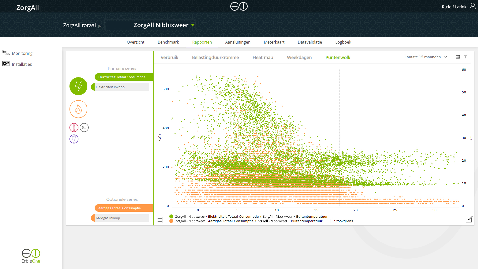
In the image you can see an example of a scatterplot were it shows things are not going as they should be. Heating is taking place above the heating curve. This could possibly be caused by cooling and/or heating at the same time. Wasting energy is a risk here.